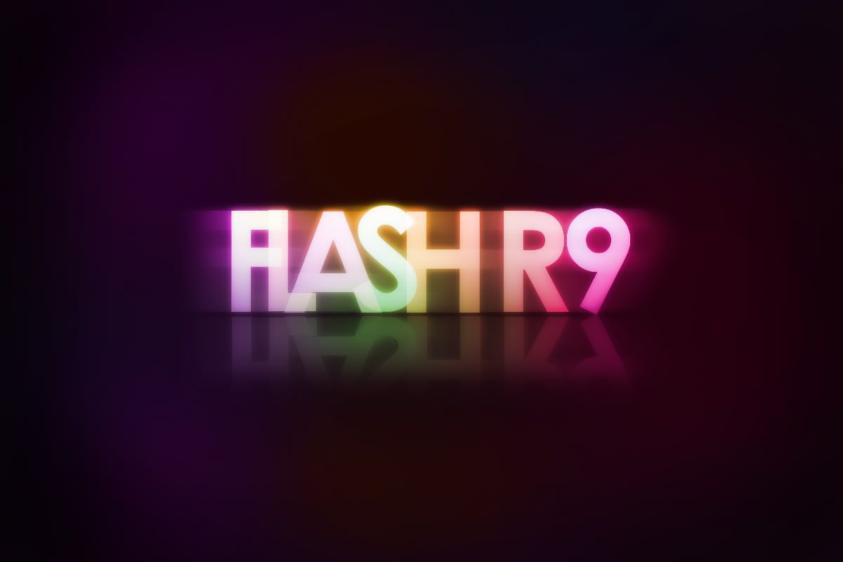
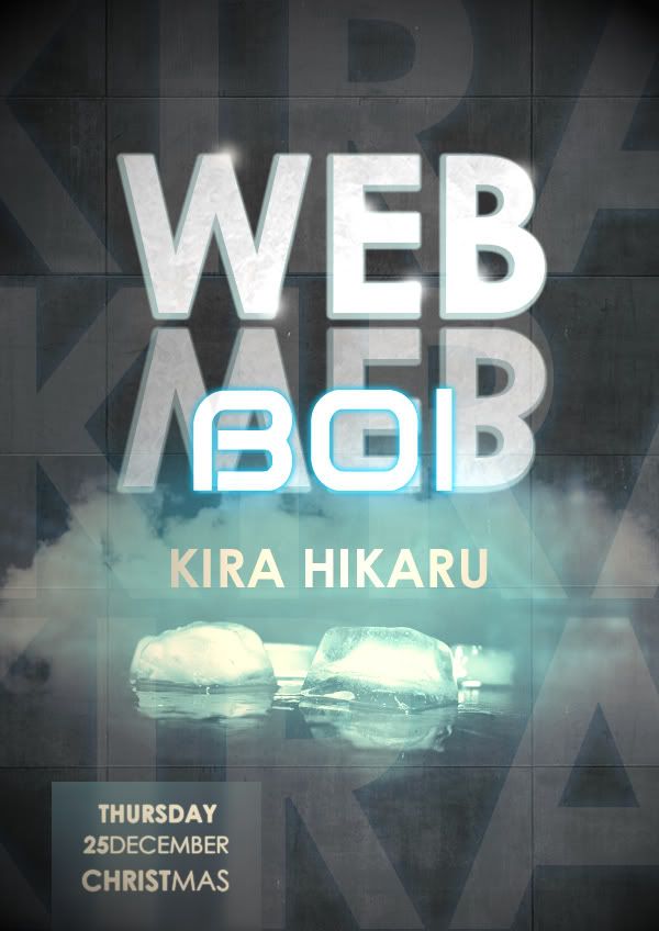
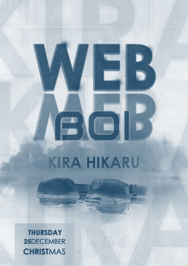
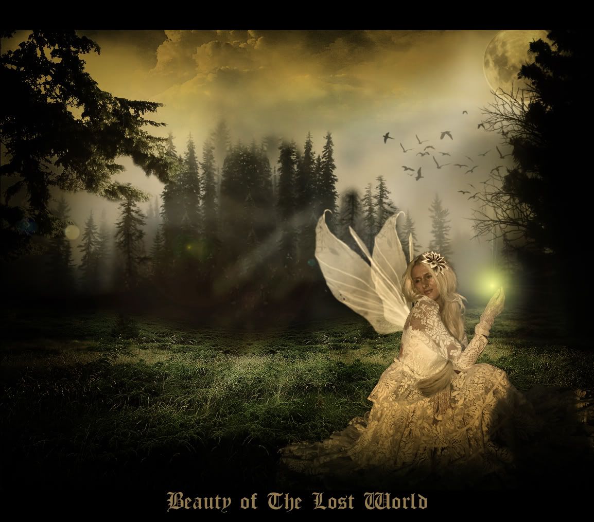
School has started and the atmosphere of busy-ness is drawing near even though this is still just the first week. So I'm rushing a few more type effect tutorials on my to-do-list before going back to be the computer science nerd for another sememster.
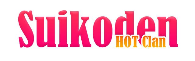
Title: SUIKODEN Hot Clan
This is so dang simple. I didn't know why it was even considered into 1 of the creative type effect. I just did it anyway.

>>Tutorial Link<<
Title: FREEZE BITE
Since this is an Ice type effect I titled it to sth along the line fo ice-cream advertisement. This tutorial works with the bare minimum to achieve great result. Very nice.

>>Tutorial Link<<
Title: New Hype
This is a very nice Techno text effect. I've been wondering how they did it for a long time. I didn't realize it's this simple.
 >>Tutorial Link<<
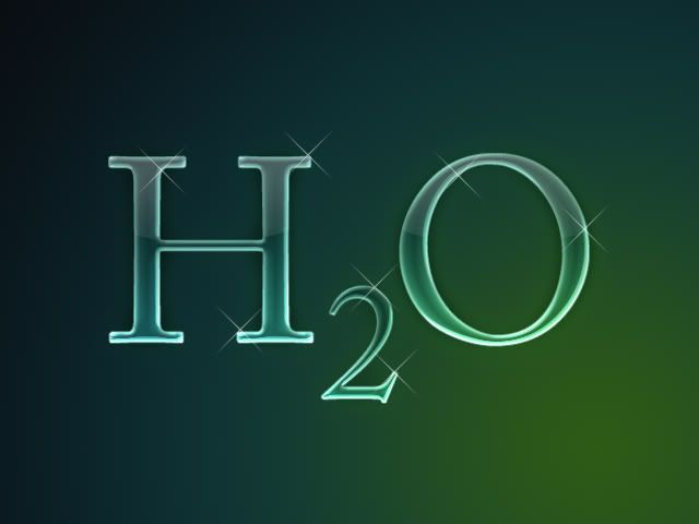
Title: H2O
Didn't know why I chose H2O for the text as well. I guess probably because of it's transparency nature and the short representation. This is one of my favorite type effects.

>>Tutorial Link<<
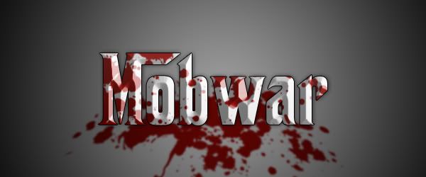
Title: Mobwar
Last but not least, the Marfia type effect. Just for completion sake. Nothing fancy, all was done by making use of the Layer Blending Options.

>>Tutorial Link<<
5:23 AM |
Category:
Design,
Porfolio
|
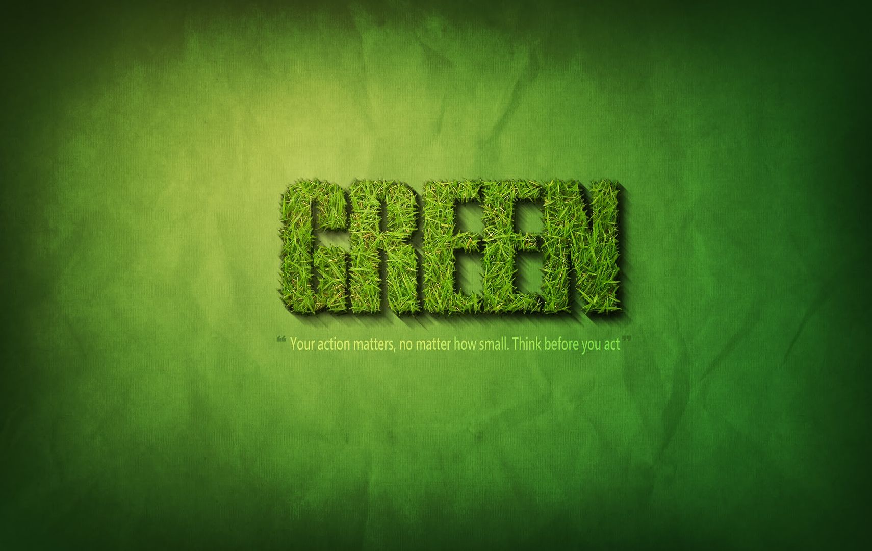
Just finished another tutorial on Grass type effect. I dedicate to piece to environmental awareness. I won't call myself an environmentalist because that would be an insult to those who really are. However, I do play my part as an individual as far as possible to minimize the effect of my actions on environment. So everyone plays your part.

>>Tutorial Link<<
8:39 AM |
Category:
Design,
Porfolio
|
Cool stylish 3D text effect done solely in Photoshop (with no help from Illustrator). Creative tutorial indeed. The result is relatively easy to achieve. The only thing that may take up time would be the part vector drawing with pen tool part.

>>Tutorial Link<<
6:37 AM |
Category:
Design,
Porfolio
|
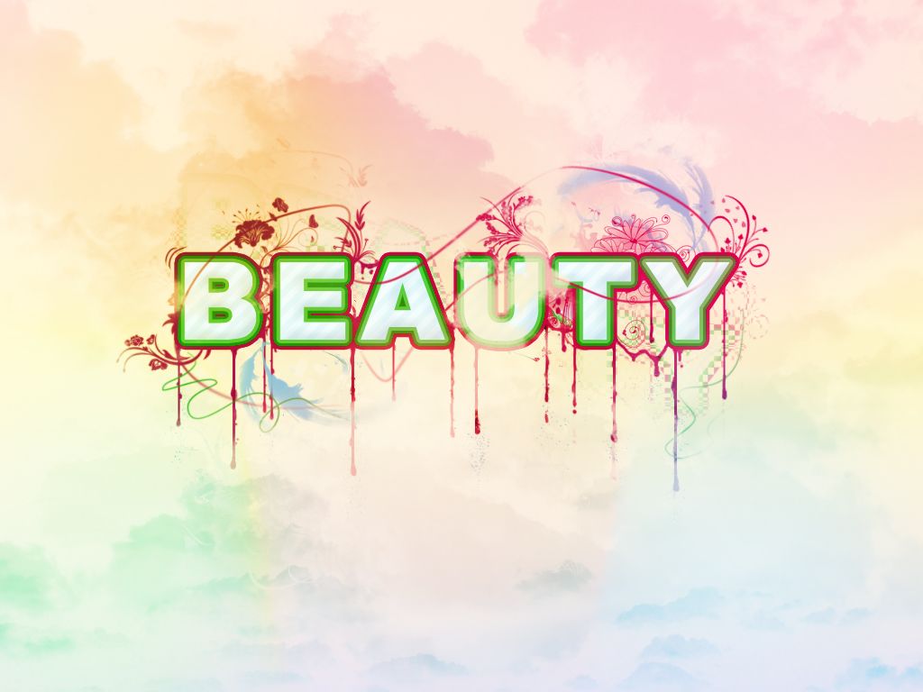
I've been looking for a good tutorial on floral type effect for a long time and finally I've found one. I like how it makes use of so many colors and yet still keeps everything relevant and in-place. Lovely. Definitely a beauty.

>>Tutorial Link<<
6:15 AM |
Category:
Design,
Porfolio
|
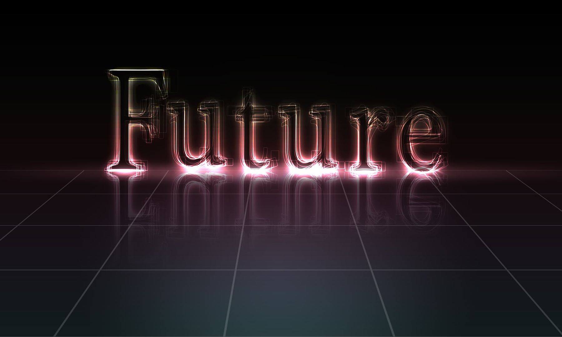
Came across this cool looking glowing text effect tutorial. I think it's pretty creative because it makes use of a few very simple techniques to achieve a rather complex result. The only complain would be that it requires to many layers which thus makes my computer become very laggy.

>>Tutorial Link<<
6:07 AM |
Category:
Design,
Porfolio
|
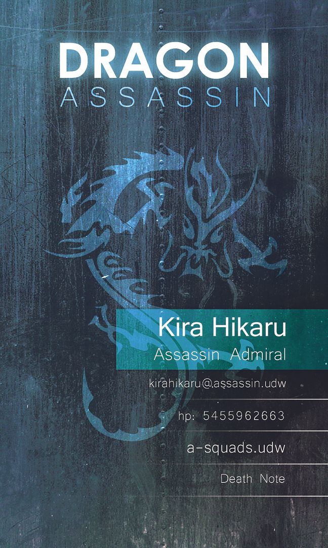
Grungy name card design. I doubt any body will use this design for their name card though. A pamphlet or brochure maybe... Anyway I just did it for fun.

5:54 AM |
Category:
Design,
Porfolio
|
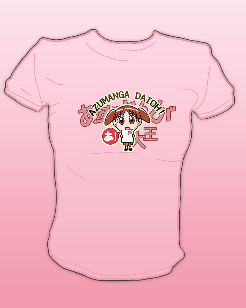
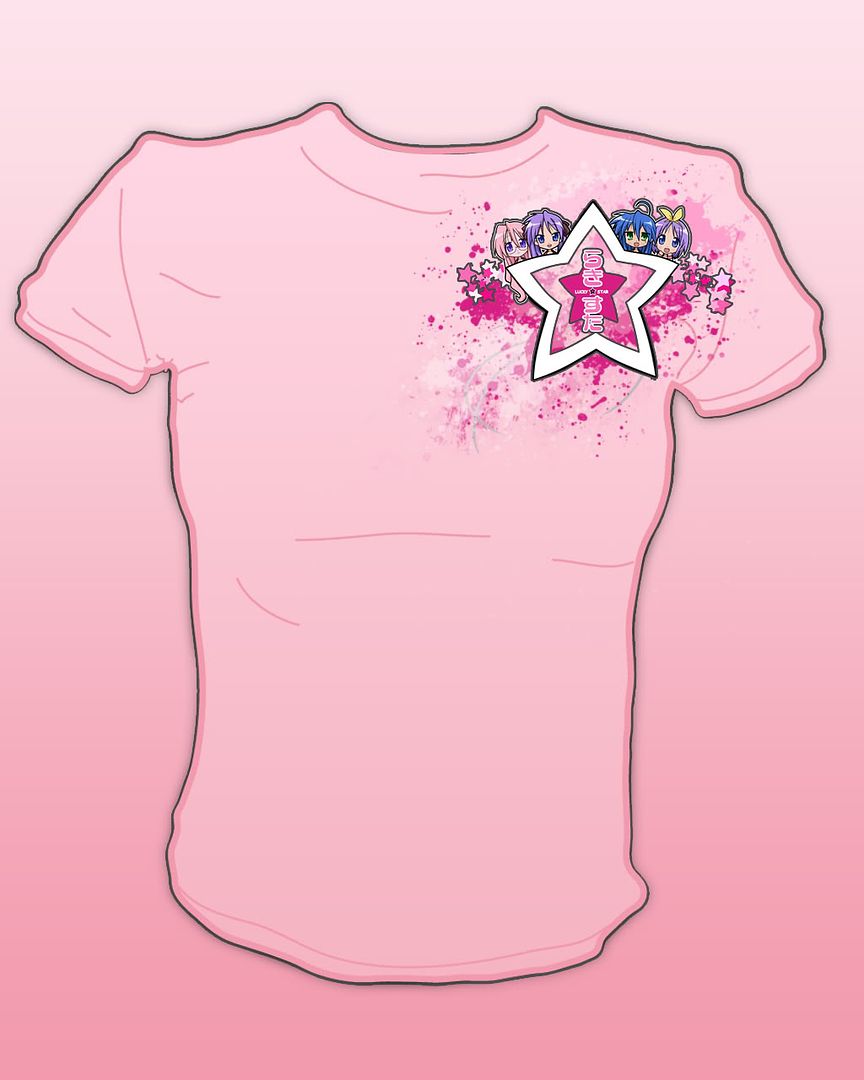
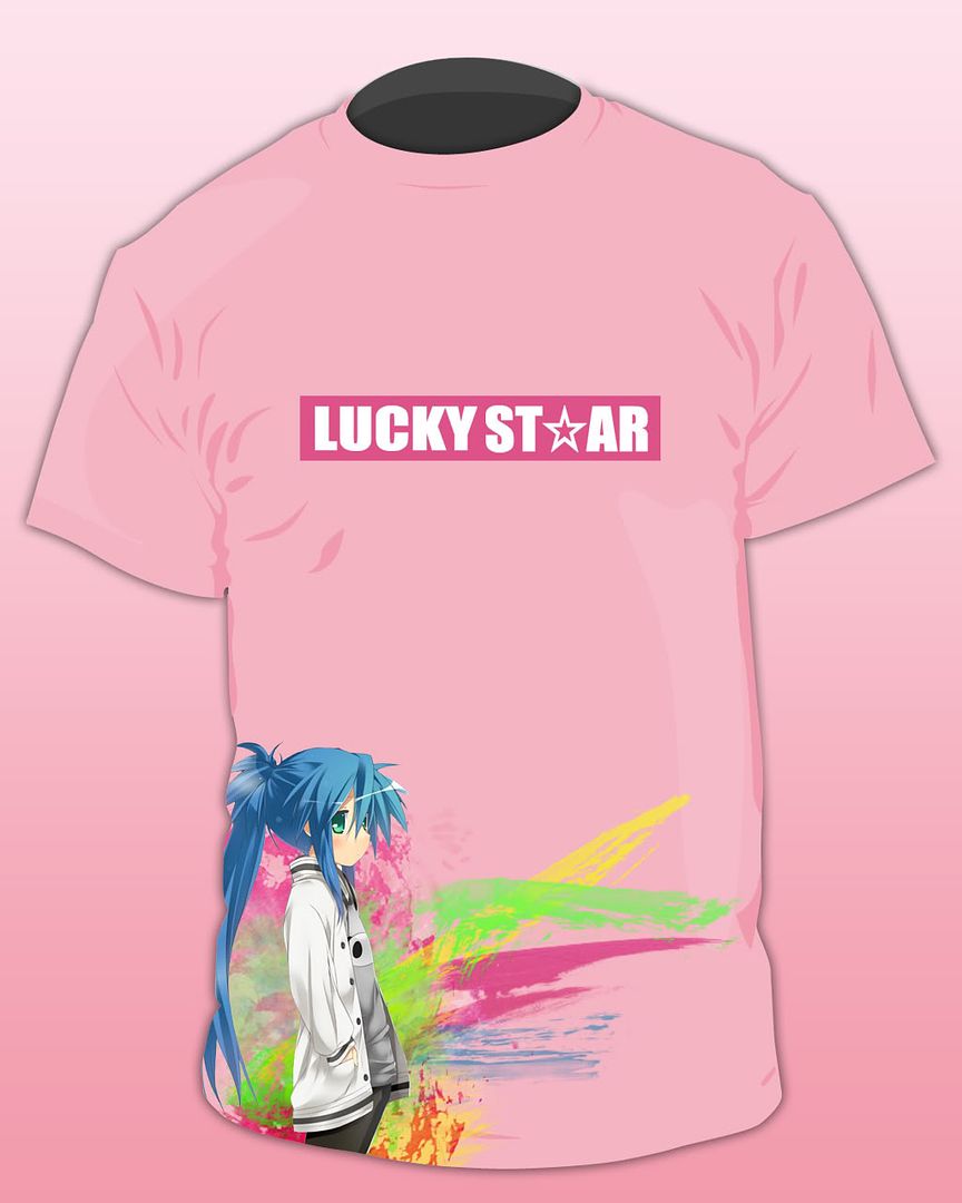
Woot! I have just finished a series of T-shirt designs. Pretty lovely. This is also my first time doing female T design. ^-^
"Don't get enough attention? Meet your personal Attention seeker."


12:12 AM |
Category:
Design,
Porfolio,
T-Shirt
|
If you've been noticing, you'd realize this effect has been used a lot in advertisement. Well, it's pretty easy to do. The challenging part would be the mix and match of color to make it look sleek and professional.
 Tutorial Link
9:20 PM |
Category:
Design,
Porfolio
|
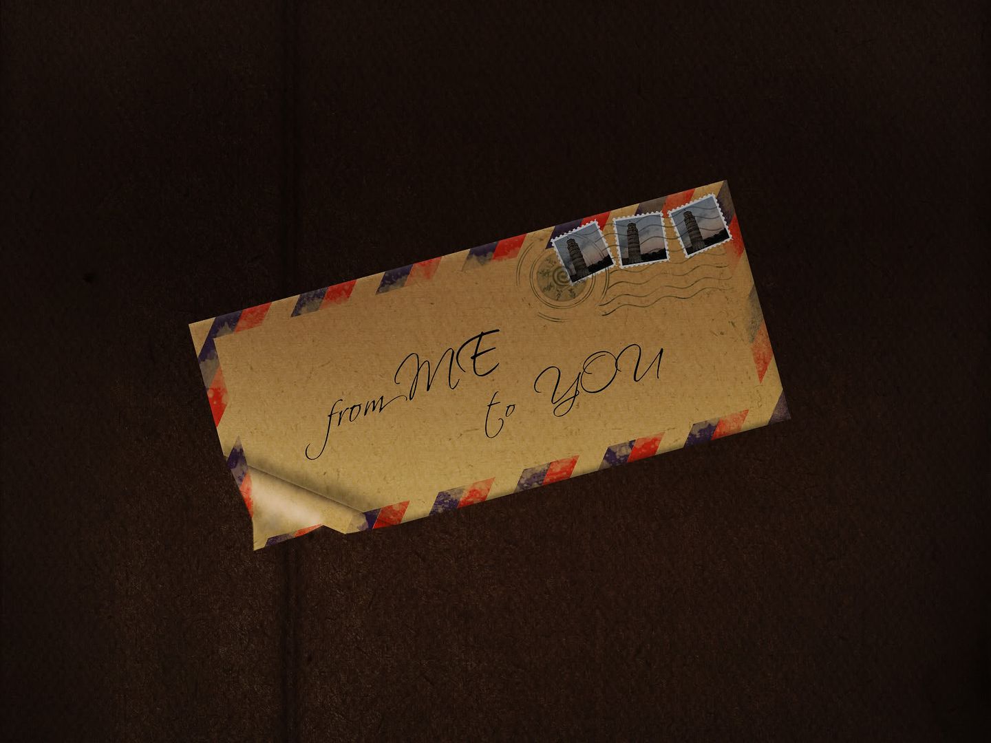
This is another from-scratch tutorial. Started with plain background and ended up with everything, magnificient!
"A Letter from me to you with no content. Read my heart."

Tutorial Link
9:15 PM |
Category:
Design,
Porfolio
|
From the tutorial, it's supposed to turn out translucent and a little glowy but I got carried away with colour then ended up exaggerating the effect a bit (I think by alot) =P. Anyway, I think it's pretty cool.

Tutorial Link
9:09 PM |
Category:
Design,
Porfolio
|
Another type effect completed. I think this type effect is very well suited for plain back ground posters. Very useful.

Tutorial Link
9:02 PM |
Category:
Design,
Porfolio
|
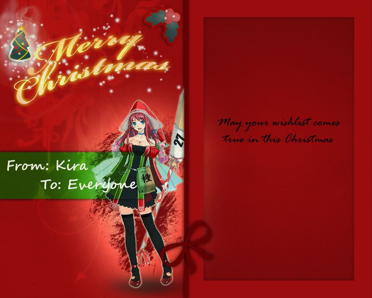
I was doing a tutorial on Photoshop light light effect, then suddenly I decided to make a Season Greeting card out of it.
 Tutorial Link
: http://abduzeedo.com/amazing-photoshop-light-effect-10-steps
6:31 AM |
Category:
Design,
Porfolio
|
Another tutorial on type effect done. This one not bad, quite cool.

And here is the unexpected result that I get while trying to get the lighting right. It looks nice.

6:10 AM |
Category:
Design,
Porfolio
|
Well just finished another Photoshop tutorial on Retro type effect. This one turned out pretty well.
 Tutorial Link
: http://psdtuts.com/tutorials/text-effects-tutorials/how-to-quickly-create-a-stylish-retro-text-effect/
5:43 AM |
Category:
Design,
Porfolio
|
Just finished a very taxing Photoshop tutorial. It took me more than 3 hours to complete this. I spent a lot of time on the lighting. I did exactly what it said but somehow the result didn't turn out as expected. So I did quite a number of improvisation on it. Although it's not as nice as the original, I think I'm quite satisfied with this.
 Tutorial Link:
 http://psdtuts.com/tutorials/photo-effects-tutorials/how-to-create-a-fantasy-photo-manipulation/
5:22 AM |
Category:
Design,
Porfolio
|
I was not trying to work on sth fancy. I just simply put up something decent and quickly add in the words and that was it.
[caption id="" align="aligncenter" width="330" caption="I was trying to make it to have kinda vintage feel but turned out to be crap. -.-""]

[/caption]
1:30 PM |
Category:
Design,
Porfolio
|
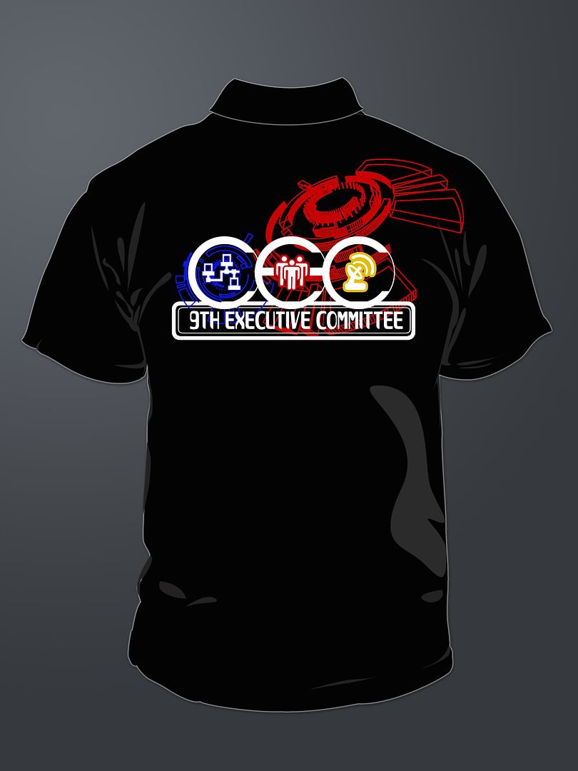
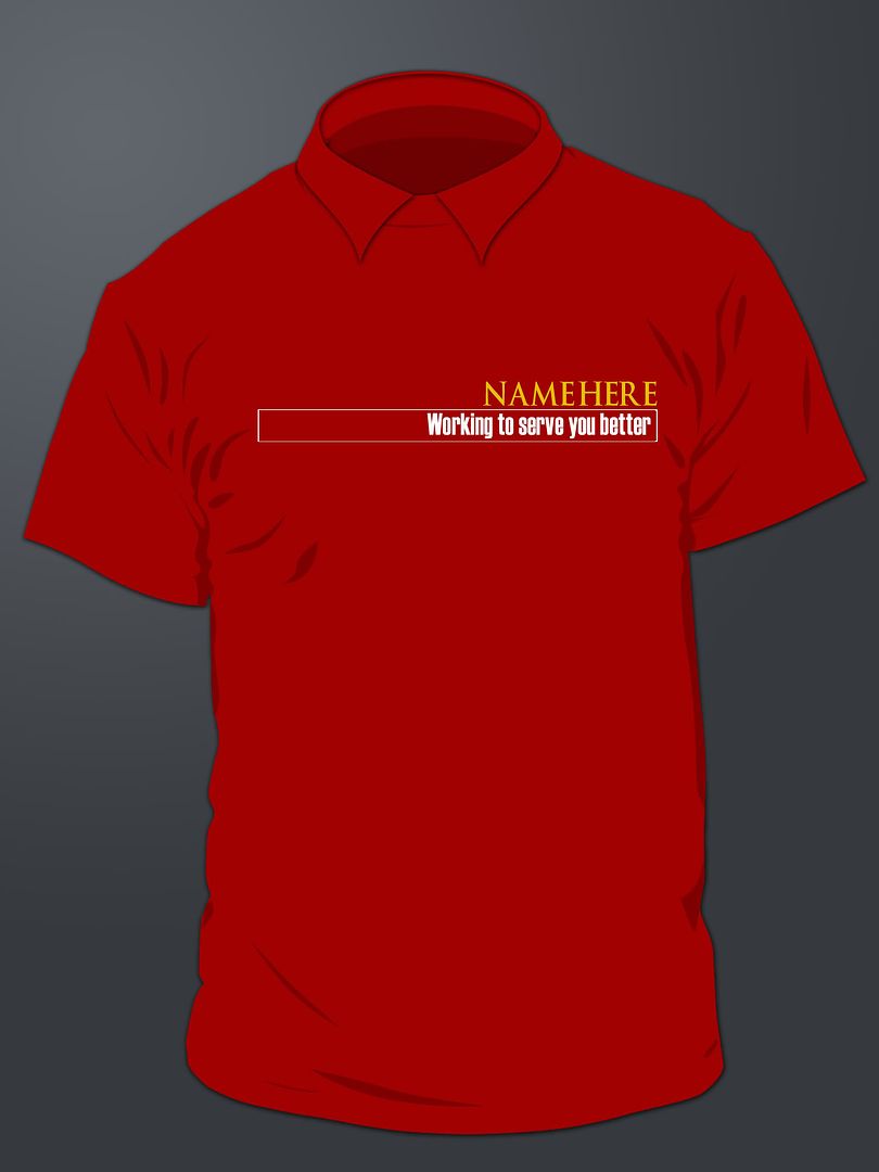
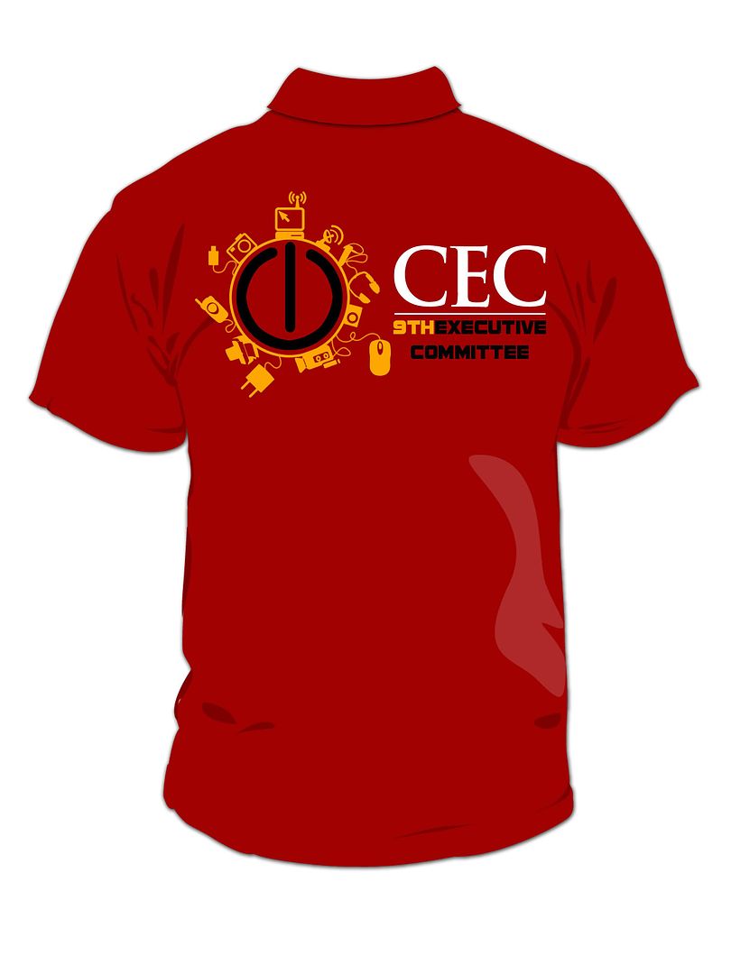
Well as the title says. I hope I will get to wear one of my very own designs. That will be awesome.
[caption id="" align="aligncenter" width="324" caption="I don't really like this front. But I was quite lazy to think of a way to improve on it"]

[/caption]
[caption id="" align="aligncenter" width="324" caption="I definitely like this. It's made for formal Polo T."]

[/caption]
[caption id="" align="aligncenter" width="324" caption="Normal. Nothing special. Just words"] [/caption]
[caption id="" align="aligncenter" width="324" caption="Well. I love this. This is my most favorite. I had fun doing it too. I got the idea while I was browsing some design from other people on the Internet. However my follow main committee said it's too ManU. T.T"] [/caption]
1:21 PM |
Category:
Design,
Porfolio,
T-Shirt
|
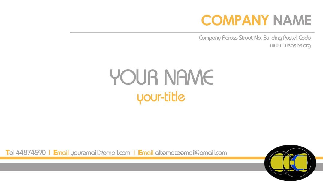
These are the name card designs I made for my faculty club main committee name card. None of them were selected though. So sad. But I had fun doing it so it's okay. Anyway, the design that won the majority votes was really good. It was done by my partner.


12:37 PM |
Category:
Design,
Porfolio
|
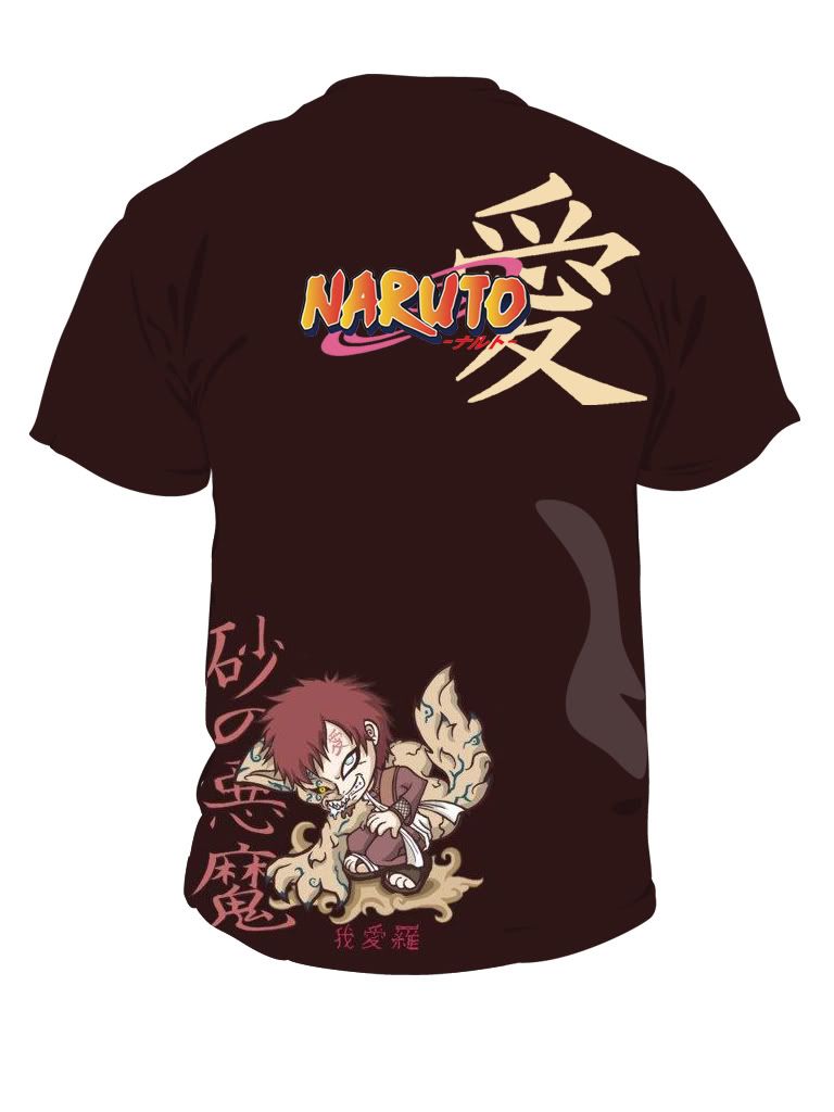
I was browsing images in
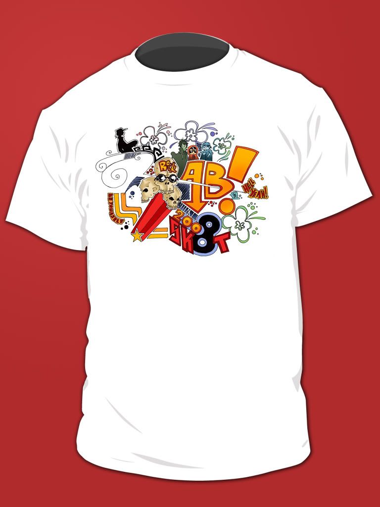
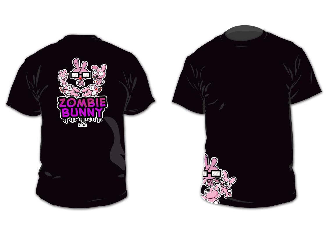
DeviantArt, then I came across some pictures which I thought would look good as a T-Shirt design. So I grabbed those pictures and put them on a T-Shirt. Here are the results:
NARUTO: GAARA DESIGN
Comment: I like this. I hope I can get this T-shirt printed.

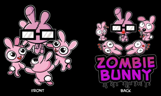
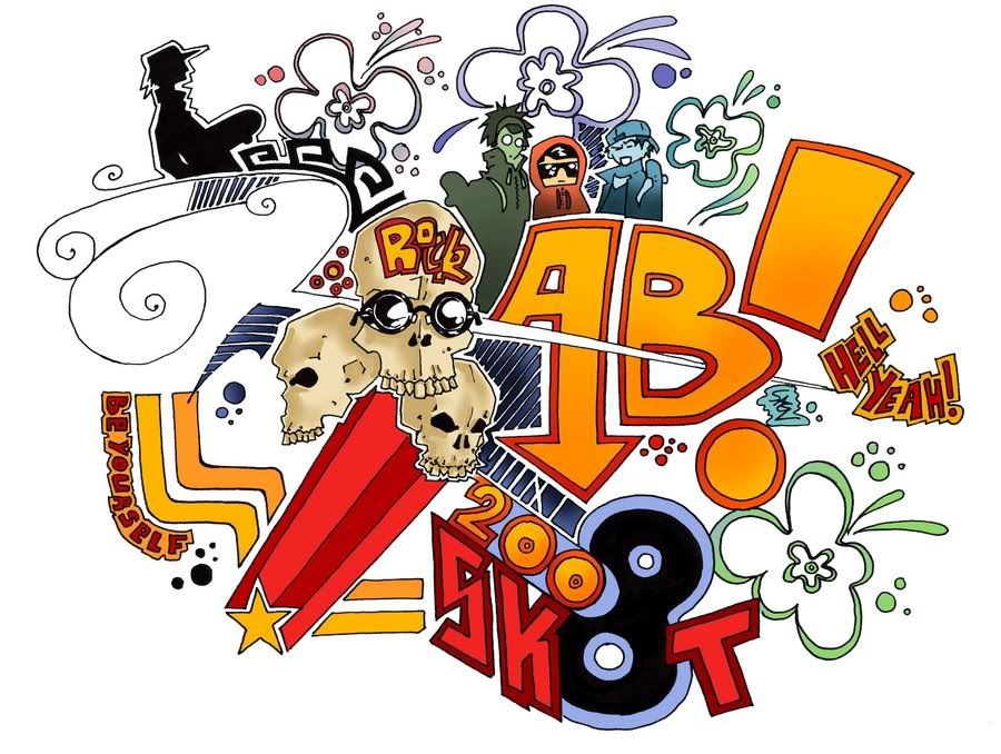
Below are: FXTUDIO Design, AB!SK8T Design, and ZOMBIE BUNNY Design
Comment: FXTUDIO is nice. Blood red and black just click. AB!SK8T is cool too but too bad it only look nice on white T and I don't really like white T. ZOMBIE BUNNY? Don't Like.


Images Resource Used:
Zombie Bunny, Gaara, Naruto logo, Gaara Kanji, FXTUDIO, AB!SK8T
7:24 AM |
Category:
Design,
Porfolio,
T-Shirt
|